Marker Pop Tuesday Tip - Choosing Color Schemes
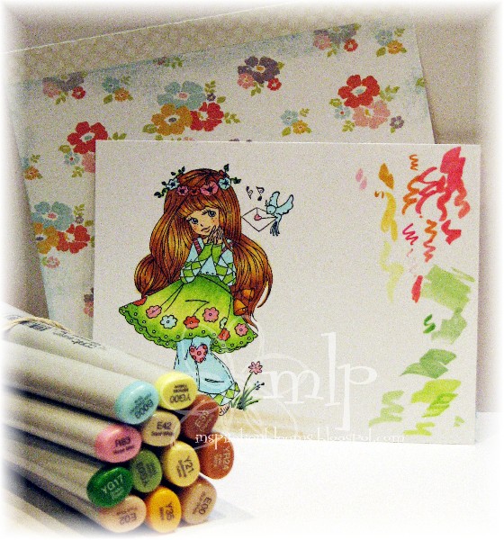
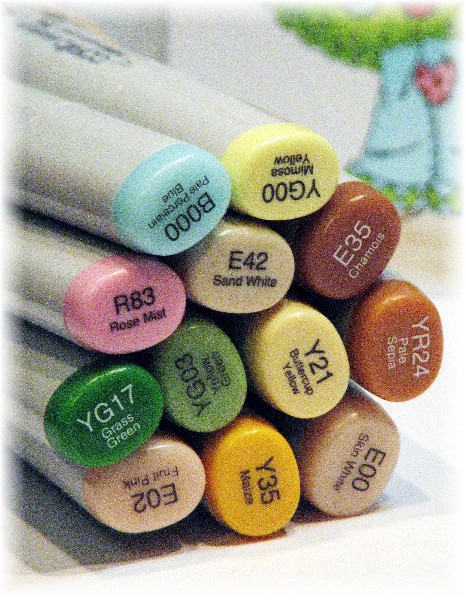
I start by selecting a piece of patterned paper that catches my eye. It may not even be a piece that I end up using on my end project. In this case I selected one sheet of paper from a 6x6 pad and based by color scheme from it. You can see I was testing markers as I went...some Copics I know well enough that I don't have to color test, and others I just grab a handful that I think might work and match up my paper to my tests and go from there.
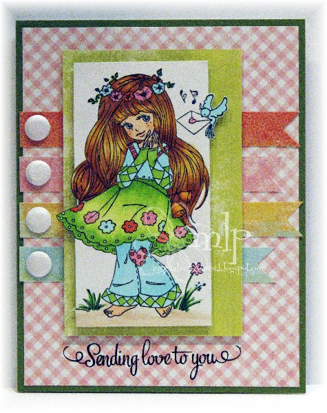
Also..be sure to shop your stamp collection for sentiments! My main image and my sentiment are from two different companies, but it stretches your card making varieties if you mix and match!
Supplies: Authentique Delightful Collection Whimsy Bella Sole Special Delivery Wild Rose Studio Bella With Bouquet Copic Markers


Comments
Blessings
Maxine
Paula