Glitter Study: Elizabeth Craft vs. Art Institute
 Well...I really didn't last very long....about an hour after I posted my last blog post I caved and bought some of the Crystal Glitter Ritz (Cool Highlight) that Elizabeth Craft uses. Glitter is a bit tricky to photograph...and these all look better IRL...but this will give you an idea anyway!!
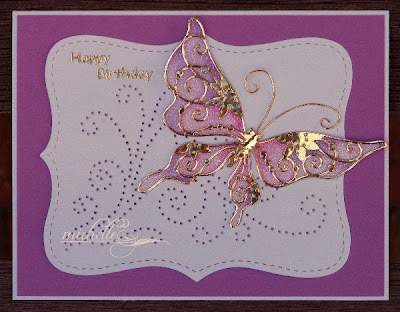
My first card is done by attaching the Stampendous Class A *Peel* sticker to a sheet of the Sookwang double sided sticker paper. I then covered my panel with my new glitter. I used SU!'s Orchid Opulence and Pixie Pink markers to add a bit of color. Then to color your glitter, use a water pen to pull your color for the watercolored effect! I got my supplies from Heidi at The Stamp Shoppe...and I also borrowed her gorgeous color scheme...and since I was in a purple mood....I used Orchid Opulence cardstock and this color scheme for my glitter study!
What I liked about this card....the glitter is super-smooth and makes coloring a dream! I attached my sticker paper to white cardstock in this case and cut out my image.
Other items on this card: SU! Top Note Die ~ Fred, She Said Frame and Flourish Piercing Template ~ Stampendous word stickers, gold wire

This card uses Art Institute's Crystal Ultrafine Transparent Glitter and the same technique as above. I layered my sticker sheet on white cardstock, and the whole panel is glittered.
Observations: The color is similar and the technique works well. The glitter has bigger chunks and the shading is not at subtle. The overall appearance of this card is more glitzy, which may take away a bit of the butterfly's punch.
Other items on this card: SU! Top Note Die, satin cording, Stampendous sentiment.
 This card uses Elizabeth Craft's Crystal Glitter Ritz Cool Highlight Glitter as did the first card in this post. The only difference is that I layered my sticker paper onto SU!'s Orchid Opulence cardstock. The colors are more muted here due to my cardstock choice, but it is subtle and gorgeous.
Other items on this card: Impression-Obsession sentiment, Anita's Art Stamps Outline Stickers, Fiskars Edge Punch, SU! Orchid Opulence ink.
This ink does match IRL....looks wonky on here though!
 This card uses Art Institute's Crystal Ultrafine Transparent Glitter over SU!'s Orchid Opulence cardstock as well. Again, the high glitter factor makes the shading harder to see.
On this card I used clear crystal Mark Richards gems and colored them with my Copic V06 Lavender Marker...making myself perfectly matching gems!
Other items on this card: Martha Stewart punch around a page punches, gold wire, Anita's Art Stamps Outline Stickers and an Inkadinkadoo sentiment stamp.
 This final card uses Art Institute's Pearl Ultrafine Pearlescent Glitter over SU!'s Orchid Opulence cardstock. This one was the hardest to get the color to work with. It is still a very pretty card, but honestly is my least favorite combination.
Other items on this card: Cuttlebug Birthday embossing folder, more Copic-colored clear gems and SU! Elegant Eggplant cardstock.
So bottomline: All of these glitters work. Elizabeth Craft glitter is the most refined and gives the best results. However, if you have the Art Insitute glitters, give this technique a shot...your cards will be pretty and it's fun to do! I'd love to hear what you think!!


Comments